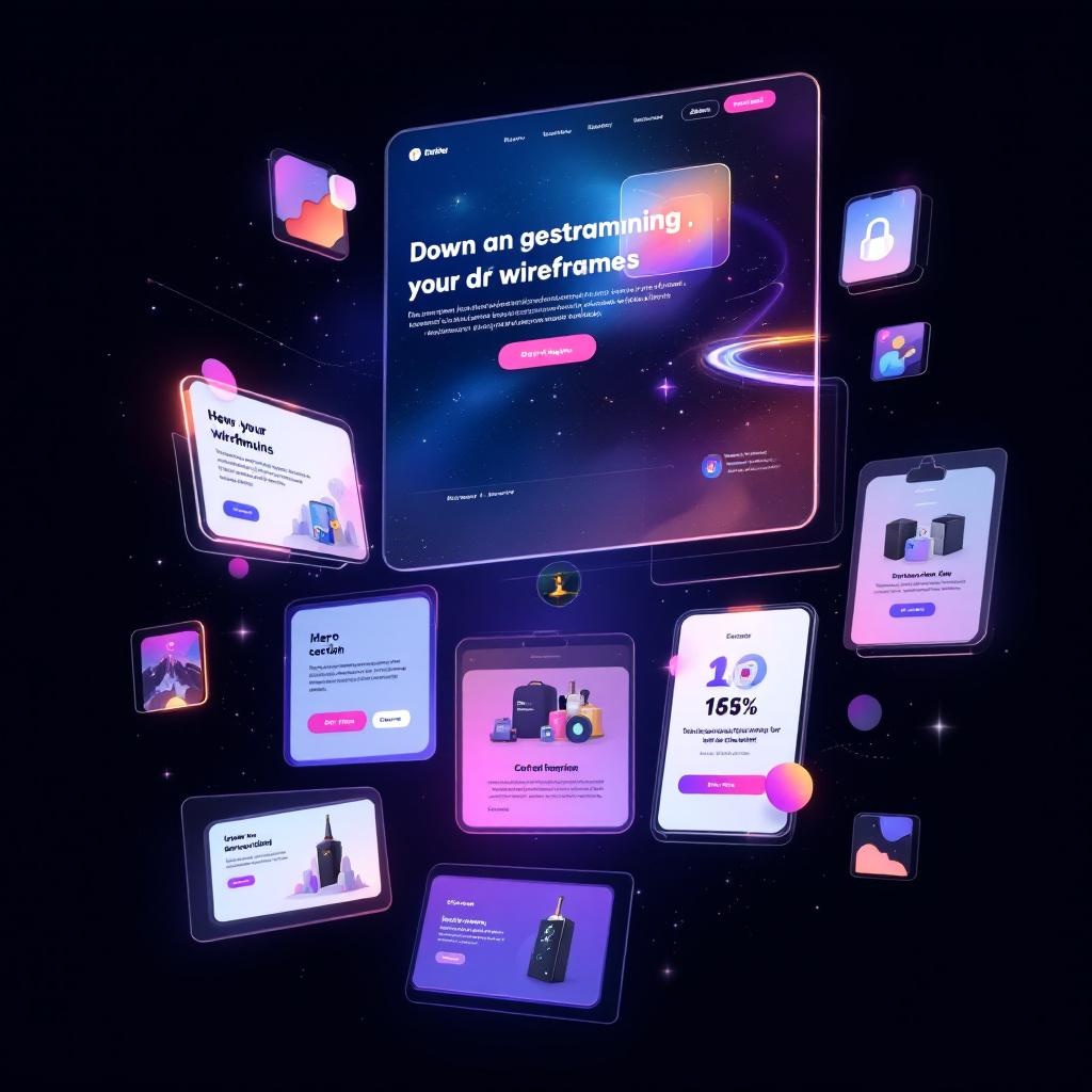
Most landing page tools are designed for people who want to build a page. We needed a system designed for pages that convert.
There is a meaningful difference. Drag-and-drop builders optimize for creative freedom — wide template libraries, customizable widgets, animation options, integration ecosystems. The assumption is that you want flexibility, and the tool's job is to get out of your way.
But flexibility is the enemy of conversion-focused landing pages. Every unnecessary element, every extra navigation link, every layout choice that isn't driven by conversion data — those are decisions that hurt performance. The best landing pages are not the most creative ones. They are the most disciplined ones.
So we built our own system. Not a page builder. A page system — with opinionated architecture, traffic-matched templates, a component library designed around conversion psychology, and a zero-friction split testing layer that lets us iterate on live pages without touching code.
This is how it works.
The Problem With Page Builders
We used the popular tools. Unbounce, Instapage, Landingi. They are good products for what they are. But for performance marketing — where every element on the page needs to earn its place — they introduced friction in three places that matter.
Speed. Page builders load JavaScript frameworks, tracking libraries, font stacks, animation engines, and widget bundles. Even a "simple" page carries 500KB-1MB of overhead before your content renders. For paid traffic where 53% of mobile visitors leave if the page takes more than three seconds, that overhead is not free.
Structure. Drag-and-drop tools let you put anything anywhere. That sounds like a feature. In practice, it means every page is a custom build, and there is no enforced consistency between pages. When you are running campaigns across multiple audiences and traffic sources, you need structural consistency — the same section patterns, the same hierarchy, the same conversion logic — with only the content varying.
Testing. Most page builders treat A/B testing as a separate feature that duplicates the entire page. You create "Variant B," clone the page, change the headline, and run traffic to both. That works for simple tests. But when you want to test a headline on Monday, a CTA on Wednesday, and a hero image on Friday — across multiple pages — the clone-and-split model falls apart. You end up with dozens of page variants and no clean way to manage them.
We needed pages that load fast, follow consistent conversion patterns, and can be tested at the element level without duplicating anything.
The Architecture: Components, Not Templates
The system is built on a component library. Every section of every landing page is assembled from a defined set of components, each with a specific conversion purpose.
Hero components (H1-H6). Six hero patterns, each designed for a different scenario. H1 is a product-focused hero for high-intent search traffic — the visitor searched for this product, so we show it immediately. H3 is a testimonial-led hero for cold Meta traffic — they do not know us yet, so we lead with social proof. H6 is a minimal hero for luxury or B2B contexts where a hard sell would feel wrong. Each hero has a documented use case and a documented anti-pattern: H4 (urgency hero with countdown timer) should never be used with manufactured deadlines, because fake scarcity kills trust faster than it creates conversions.
Social proof components (SP1-SP6). Review carousels, star rating bars, "as seen in" logo strips, video testimonials, aggregate review stats, user-generated content galleries. The selection matrix considers how much proof the audience needs. Cold Meta traffic with no brand awareness gets heavy social proof (SP1 review cards plus SP3 trust logos). Branded search traffic that already knows us gets lighter proof (SP5 aggregate stats) positioned further down the page.
Product display components (PD1-PD5). Single product cards, comparison tables, bundle displays, feature grids, ingredient/spec breakdowns. The choice depends on whether the visitor needs to be convinced of the product category (show the comparison), convinced of this specific product (show the features), or just needs to see the price and buy (show the card).
Call-to-action components (CTA1-CTA5). Primary buttons, sticky bars, floating CTAs, inline form captures, multi-step opt-ins. Every CTA component includes a reassurance element — "Free shipping," "30-day guarantee," "Cancel anytime" — because a button without reassurance leaves the last objection unanswered.
Visual elements (VE1-VE10). Dividers, badges, trust seals, icon grids, callout boxes, comparison indicators. These are the connective tissue that gives a page visual rhythm without introducing noise.
The component library is not decorative. Each component has selection criteria driven by the traffic source, the audience's awareness level, the product's price point, and the primary objection we need to overcome. When a new page gets built, we do not browse a gallery and pick what looks good. We run the brief through a decision matrix and the matrix tells us which components to use and why.
Traffic Source Determines Page Architecture
This is the decision that most landing page strategies get wrong: treating all traffic the same.
Someone who typed "cotton dryer sheets review" into Google is not in the same mental state as someone who saw a lifestyle photo in their Instagram feed. The first person has high intent and specific awareness — they know the product category, they are evaluating options, and they want information that helps them decide. The second person was not looking for anything. They were scrolling. Something caught their eye. They might not even understand why they clicked.
These two visitors need fundamentally different pages. Not just different headlines — different architecture.
The Convincer (Google Search, High Intent)
For high-intent search traffic, we use what we call the Convincer template. The logic: they already know what they want. Our job is to convince them that this product is the right choice.
Architecture:
- H1 hero (product-focused, immediate) — show the product they searched for within the first viewport
- SP5 stats bar (aggregate reviews, key specs) — reinforce credibility without slowing them down
- PD3 feature grid — specific features that differentiate from competitors
- SP1 review cards — real customer quotes addressing common concerns
- CTA3 sticky bar — persistent purchase option as they scroll
- FAQ accordion — address remaining objections
- Final CTA section with guarantee
The page is relatively short. High-intent visitors do not need to be educated about the problem. They need product details, social proof, and a clear path to purchase.
The Educator (Meta Prospecting, Cold Traffic)
Cold traffic from Meta ads needs a fundamentally different approach. These visitors were interrupted. They did not ask for this. They are problem-aware at best — they might recognize the pain point, but they do not yet believe that your product is the solution.
Architecture:
- H3 hero (testimonial-led) or H2 (video) — start with proof or a hook, not a product pitch
- Problem/agitate section — articulate the pain they may not have words for yet
- Solution section — introduce the product category as the answer
- PD4 comparison table ("Us vs. Them") — position against the familiar alternative
- SP1 + SP2 testimonials — heavy social proof, multiple voices
- PD1 product card with pricing — now they are ready to see the offer
- Risk reversal section — guarantee, free returns, easy cancellation
- CTA5 final push with urgency (only if real)
- FAQ — address deeper objections for the skeptical remainder
This page is longer. It follows a persuasion arc: problem, agitation, solution, proof, offer, reassurance. Cold traffic needs to be walked through the entire decision-making process because they started from zero.
The Showcase (Meta Retargeting, Warm Traffic)
Retargeting visitors have seen the brand before. They visited the site, maybe added to cart, and did not purchase. They do not need to be educated. They need a reason to come back.
Architecture:
- H1 or H5 hero — product-focused, possibly with a special offer
- SP6 UGC gallery — show real people using the product (this is what they missed)
- PD5 bundle display — give them a better deal than the one they walked away from
- SP1 reviews focused on post-purchase satisfaction — "I was skeptical too, but..."
- Single strong CTA with incentive
Shorter page. Higher conversion rate. Different job.
The template selection happens in Phase 1 of the build pipeline, before any copy is written. The traffic source determines the template, the template determines the component sequence, and the components determine what copy and assets we need. The entire system flows from that first question: where is this visitor coming from, and what do they need to see?
The Split Testing Layer
Testing is where the system diverges most sharply from conventional landing page tools.
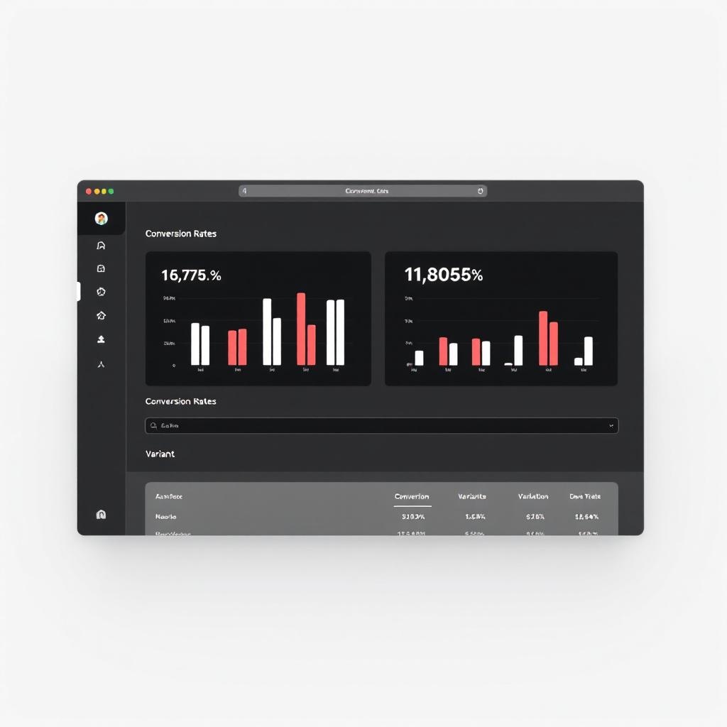
Our split testing infrastructure has three parts: a browser-based admin dashboard, a lightweight JavaScript runtime, and a Supabase backend. Together, they let us define, run, and analyze element-level A/B tests on live pages — without deploying code.
How It Works
The admin dashboard is a password-protected HTML page. In the "Admin" tab, we create a test by specifying a test ID, a page URL, and one or more variants. Each variant is a list of DOM changes: which selector to target, what type of change to make, and the new value.
Test: hero-headline-v2
Page: /cobi-dryer-sheets-switch.html
Variant A (control): no changes
Variant B: .hero__title → text → "Ditch the Chemicals. Keep the Softness."
Variant C: .hero__title → text → "The Last Dryer Sheet Switch You'll Make"
That is the entire test definition. No page duplication. No deployment. The test is saved to Supabase and takes effect on the next page load.
On the live landing page, a small JavaScript file (split-test.js, about 3KB) runs at page load. It fetches active test configurations from Supabase, assigns the visitor to a variant using weighted random allocation, stores the assignment in localStorage (so the same visitor always sees the same variant), and applies the DOM mutations. The change types include text, html, src (for swapping images), href (for changing link targets), style, class, hide, and show.
Known selectors we test against: .hero__title, .hero__subtitle, .hero__eyebrow, #addToCartBtn, #bundleBtn, #heroImage. These are the highest-impact elements on a page — the first things a visitor reads and the last thing they click.
The "Results" tab in the dashboard shows traffic split by variant, conversion rates, and statistical significance calculated via z-test. We set a 95% confidence threshold before calling a winner.
Why This Matters
In a conventional testing setup, changing a headline means creating a new page variant, updating the ad targeting to split traffic, waiting for results, and then merging the winner back into the main page. That process takes days of setup time and introduces campaign-level complexity.
Our system reduces it to this: open the dashboard, type the new headline, save. It is live. The runtime handles assignment, tracking, and significance calculation. We can test a headline at 9am, read the data at 5pm, and either kill it or let it run — without ever touching the landing page file or the ad campaign.
This means we test weekly instead of quarterly. And because we test at the element level instead of the page level, we can run multiple non-conflicting tests simultaneously — a headline test and a CTA color test and a hero image test, all on the same page, all tracked independently.
How a Page Gets Built: The 5-Phase Pipeline
Every landing page goes through a defined pipeline. No improvisation.
Phase 1: Brand Extraction
We scrape the client's existing website and extract brand identity: primary and secondary colors, typography (heading and body fonts with weights), visual aesthetic (photography style, lighting, mood), and logo specifications. The output is a JSON file with confidence scores — if we can only extract a color from CSS and not from visual evidence, we flag it as low-confidence and verify with the client before proceeding.
This matters because brand consistency between the ad, the landing page, and the client's main site is not cosmetic. It is a trust signal. If a visitor clicks a Meta ad and lands on a page that looks like a different brand, bounce rate increases regardless of how good the offer is.
Phase 2: Copy Framework
Features get converted to benefits. Every product attribute gets run through the formula: "[Feature] so you can [benefit] without [pain avoided]." The copy framework produces five headline variations, three subheadline options, CTA text with matched reassurance lines, and section copy for each component in the planned sequence.
The copy is ranked by conversion impact. Proof features (performance claims backed by data) come first. Core pain point resolution comes second. Differentiators come third. Secondary benefits and values-alignment copy come last. This is not subjective — it follows a prioritization framework based on what drives purchase decisions.
Phase 3: Brief Generation
The brand extraction, copy framework, asset inventory, and page architecture get compiled into a single structured JSON brief. This brief is the contract between strategy and execution. It specifies every section, every component, every piece of copy, every image placement, and every CTA destination. Nothing is left to interpretation during the build phase.
The brief also documents why each component was selected. If a reviewer questions why we used a comparison table instead of a feature grid, the reasoning is recorded in the brief: "Traffic source is Meta prospecting. Audience awareness is problem-aware. Primary objection is skepticism about switching from traditional dryer sheets. Comparison table (PD4) directly addresses the switching objection by showing familiar vs. new side-by-side."
Phase 4: Build
The page gets assembled from the brief. Self-contained HTML. All CSS inlined in <style> tags. No external frameworks, no CDN dependencies, no build step. The output is a single .html file that loads in under one second on a 3G connection.
We use CSS custom properties (variables) for every color, font, spacing value, and radius. This means a brand refresh — new primary color, different heading font — requires changing a few variable values, not rewriting the stylesheet.
Every image gets lazy loading for below-fold assets. Every button has a minimum 48px touch target for mobile. Every CTA has reassurance text within visual proximity. These are not style preferences — they are conversion requirements enforced by the build process.
Phase 5: QA Review
Before a page goes live, it passes a structured QA checklist. The checklist is divided into three tiers.
Critical (must pass): All CTA links point to the correct destination. All images load. No horizontal scroll at 375px mobile width. CTA visible without scrolling on mobile. Headline matches the ad messaging. Tracking pixels fire correctly (Meta Pixel, GA4, Clarity). No emojis anywhere on the page — this is a real rule we enforce because emoji characters render inconsistently across devices and undermine brand polish.
Conversion (should pass): Social proof visible within the first two scroll-lengths. Trust signal in the first viewport. Guarantee section present. FAQ addresses top objections. Reassurance text near every CTA.
Polish: Favicon loads. Open Graph tags populated. Alt text on all images. Consistent spacing. Smooth section transitions.
Pages that fail Critical checks do not go live. Pages that fail Conversion checks get flagged for immediate iteration.
Self-Contained HTML vs. Framework Bloat
We deliberately chose to build pages as single self-contained HTML files. No React, no Next.js, no Tailwind, no build pipeline. This is an unpopular opinion in web development circles, but the reasoning is straightforward.
Load speed. A self-contained HTML page with inlined CSS loads in a single request. No render-blocking JavaScript. No CSS framework to parse. No hydration step. The browser receives the HTML and renders it. On a 3G mobile connection — which is what many real users are on — the difference between a 200KB self-contained page and a 1.5MB framework-built page is the difference between a 1-second load and a 5-second load. That 4-second gap costs conversions.
Reliability. No CDN dependency means the page cannot break because a third-party service goes down. No JavaScript framework means the page renders even if a script fails to load. The fewer moving parts, the fewer failure modes.
Deployment. Push the HTML file to GitHub. GitHub Pages deploys it. The page is live in seconds. No build step, no CI/CD pipeline, no container, no server configuration. This simplicity means we can push a new page or a hotfix in under a minute.
Portability. The page is a file. It can be hosted anywhere. It can be emailed to a client for review by opening it in a browser. It can be archived by saving the file. There is no dependency graph to manage.
The tradeoff is that we do not get the developer convenience of components, state management, and hot reloading. We accept that tradeoff because the pages are not applications. They are conversion documents. They do not need state management. They need to load fast, look right, and make it easy to take one specific action.
What This Means for Brands
You do not need to care about component IDs or decision matrices. What matters is what the system produces:
Landing pages matched to your traffic. If you are running Google Search and Meta prospecting simultaneously, you get different pages for each — not the same page with a different headline. The architecture changes because the visitor's mental state is different.
Continuous testing without campaign disruption. We can test headlines, images, CTAs, and offers on your live pages without creating new ad variants or splitting campaign budgets. Testing happens at the page level, transparently, with statistical rigor.
Fast pages. Sub-second load times on mobile. That is not a marketing claim — it is a structural consequence of how the pages are built. No frameworks, no bloat, no third-party dependencies adding latency.
Brand consistency. Every page starts with brand extraction from your existing site. Colors, fonts, and visual style are pulled programmatically, not approximated by a designer working from memory. The result looks and feels like your brand, not like a landing page template with your logo dropped in.
Speed of iteration. A new landing page, from brief to live, takes hours — not weeks. A headline test takes minutes to deploy. When market conditions change, when a competitor launches a new offer, when your bestseller shifts — we can respond the same day.
If you are spending money on paid traffic and sending it to your homepage, a product page, or a template from a page builder, there is almost certainly conversion being left on the table. Not because those pages are bad, but because they were not built for the specific job of converting the specific traffic you are sending.
We build pages for that job. Let's talk about what that looks like for your brand.